Why a landing page works differently from a website
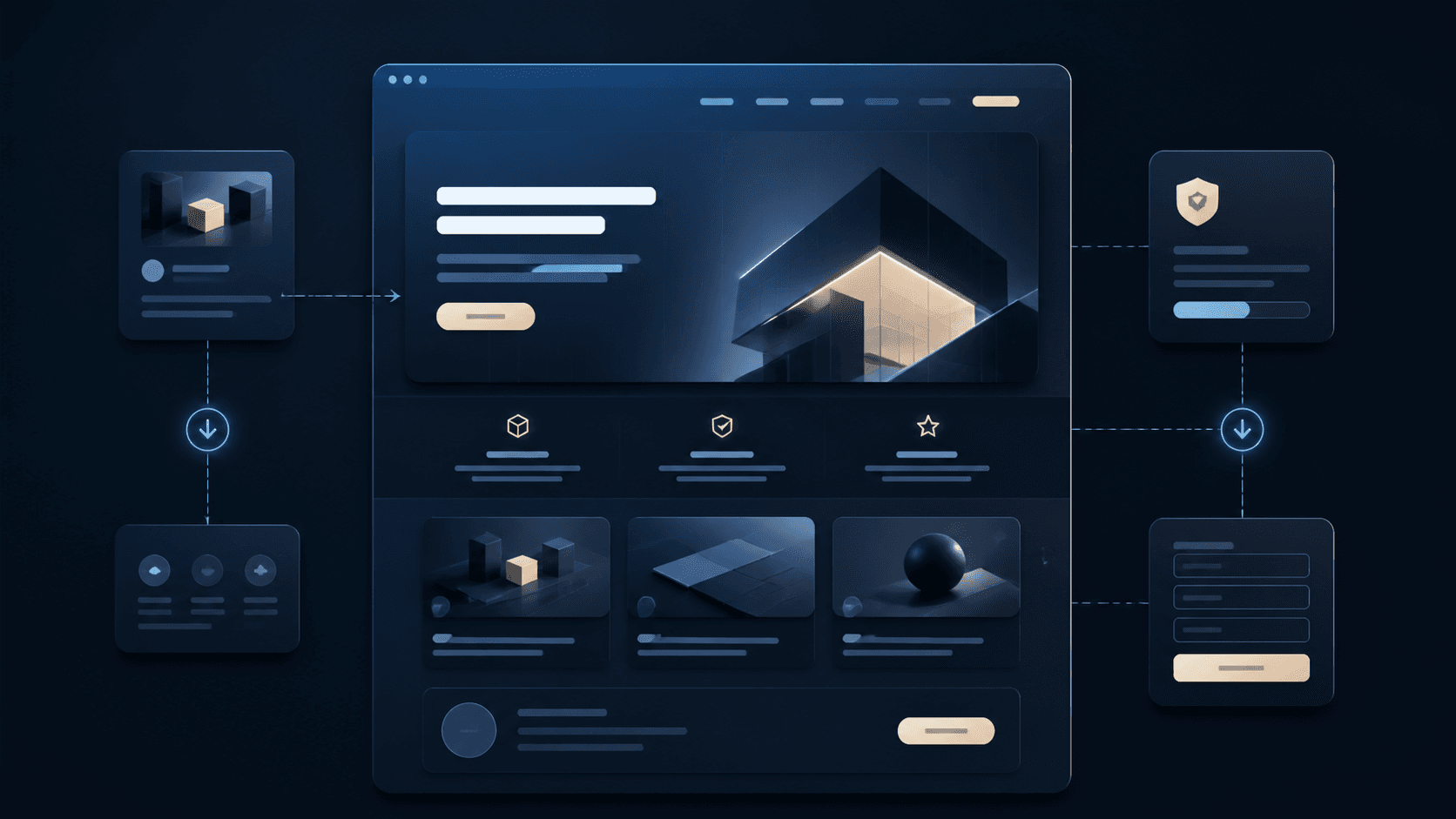
A classic website explains a company through several sections, subpages and contact routes. A landing page is conceived more narrowly: it leads visitors to one specific action, for example an enquiry, a booking, a sign-up or an offer page.
That is exactly why it needs to focus more sharply. Every section should have a concrete job: capture attention, explain the benefits, build trust, reduce objections and make the next step easy.
When a single page is enough
A landing page is often sufficient when an offer is clearly defined and visitors do not need a deep page structure. This could be a specific service, a seasonal offer, a campaign, a consultation format or a local appointment service.
The important thing is that the decision remains manageable. If customers first need to compare many services, check team details or read extensive content, a full website is usually the better choice.
- A single offer is the focus
- The next step is clearly measurable
- Visitors arrive from a campaign or ad
- The most important questions fit on one structured page
Which building blocks a good landing page needs
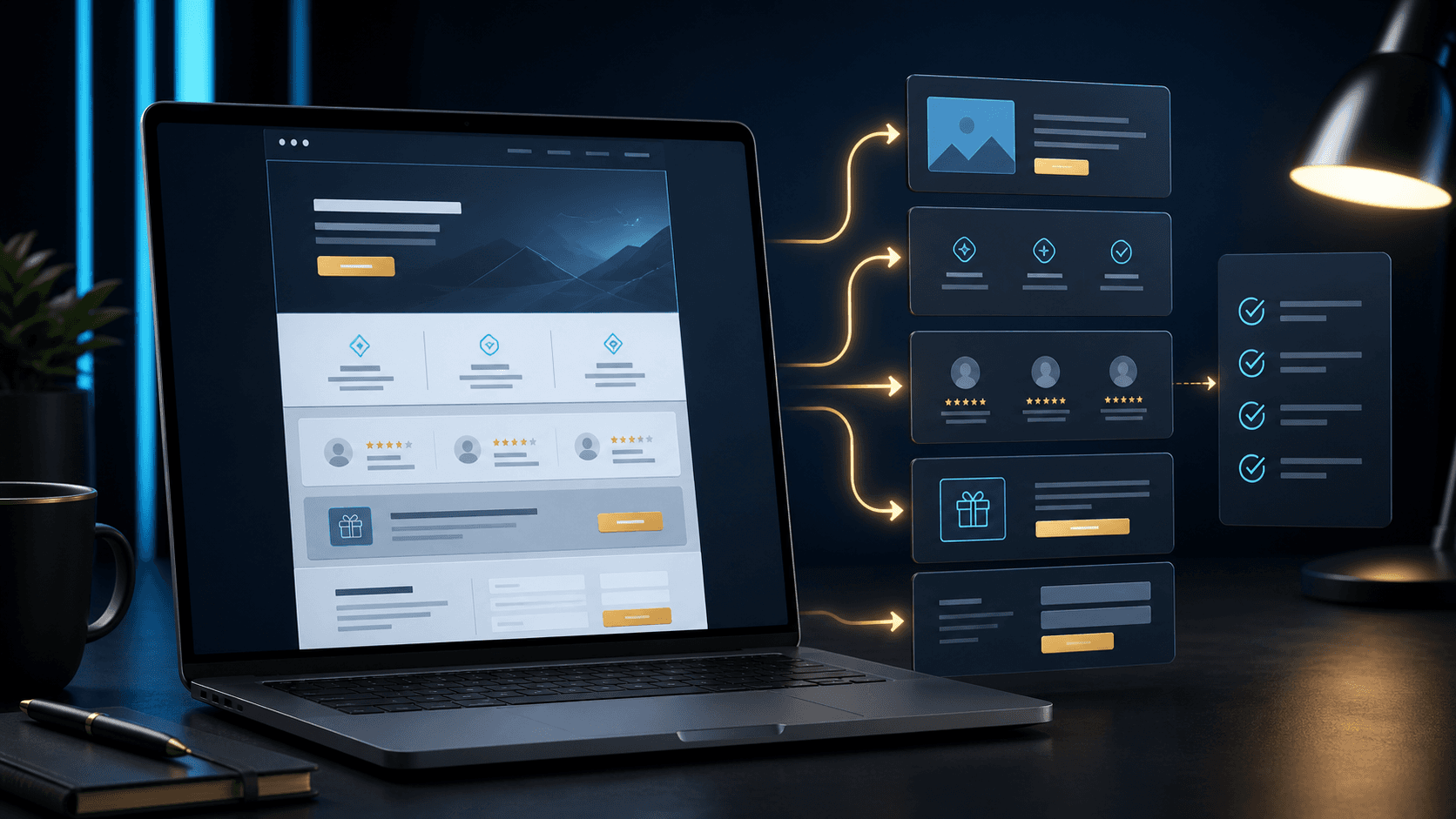
A strong landing page starts with a clear statement. Visitors must immediately understand what it is about, who the offer is for and why they should keep reading. This is followed by benefits, proof and a simple contact route.
The structure should not feel random. Good landing pages lead from initial orientation to a decision: problem, solution, advantages, trust, process, FAQ and enquiry.
- A clear hero section with concrete benefits
- A short description of the service or offer
- Trust signals such as examples, reviews or experience
- A visible CTA in several sensible places
What makes landing pages weak
Many landing pages lose impact because they are built like a shortened homepage. Too many topics then sit side by side, the main action is unclear or visitors have to search for a long time before they can get in touch.
Too much design can also get in the way. Animations, big effects or vague imagery do little to help if the offer is not explained precisely. A landing page should look high-quality, but above all it should remain understandable.
- Several equally important goals on one page
- Unclear headings without a concrete benefit
- Too little trust before the contact form
- A contact button only at the very end of the page
How Digital Vision plans landing pages
Digital Vision plans landing pages starting from the goal. First, we clarify which action is to be achieved, which visitors will come to the page and which questions need to be answered before an enquiry.
Then a page is created with a clear sequence, a fitting design, fast loading times and a contact route that does not get lost in the layout. This way the landing page is not only attractive, but measurably useful.