Why the homepage can decide so much
For many visitors, the homepage is the first contact with a business. In that moment no complete judgement is formed yet, but there is a clear sense of whether the website feels understandable and professional.
If the entry point is unclear, visitors first have to search for what it is all about. That costs attention and often already weakens the next step.
Which questions should be answered immediately
A strong homepage quickly answers the core questions: What is on offer, who is it for and why should someone keep reading or get in touch here?
These answers do not need to be given in long texts. Often a clear opening, an understandable subheading and a sensible order of content are enough.
- What is the concrete offer?
- Which problem is being solved?
- Who is the page intended for?
- What is the intended next step?
How a good sequence guides visitors
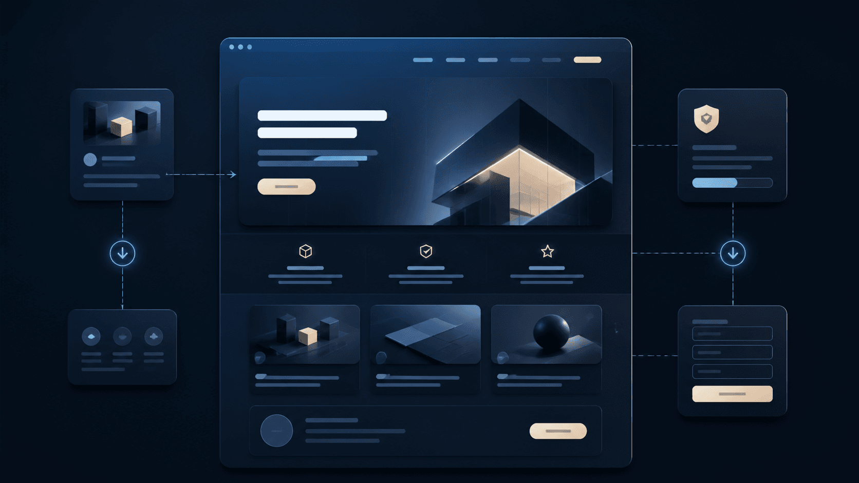
The homepage should not try to show everything at once. A clear dramaturgy works better: opening, services, benefits, examples, trust and contact.
This way the visitor first understands the offer, can then gain confidence and is only afterwards guided purposefully towards an enquiry. This sequence feels calmer and more convincing than a collection of equally weighted blocks.
- Hero section with a clear benefit
- Explain services compactly and understandably
- Build trust through references or insights
- Place the contact path visibly and appropriately
Why too many signals weaken the entry point
Many homepages get lost in animations, long welcome texts or several competing messages. Visitors then see a lot but understand little.
A reduced structure does not mean the page has to look empty. It means that every section has a clear job and prepares the next one.
- Do not run several main messages in parallel
- Keep button wording clear
- Use short sections instead of walls of text
- Always consider the mobile view
How Digital Vision plans homepages
Digital Vision develops homepages from the visitor's perspective. The first step is to clarify what goal the page has and which information is really needed at the start.
The result is entry points that do not just look good but connect services, trust and contact in a logical way.