Why service pages are often too unclear
Many service pages explain too much and too little at the same time. They name offers but leave open who they are intended for, which problem is solved and what happens after the enquiry.
Visitors then have to work out for themselves whether an offer fits. The more thinking is required, the more likely it is that contact gets postponed or abandoned altogether.
What a good service page should answer
A strong service page answers the most important questions before they are asked. Visitors should understand what result they can expect and which steps are needed to get there.
This is not about as many details as possible but about clear orientation. The page has to provide enough certainty to make the next step plausible.
- What exactly is on offer?
- Who is the service suitable for?
- What result is produced in the end?
- How does the collaboration work?
How to structure content better
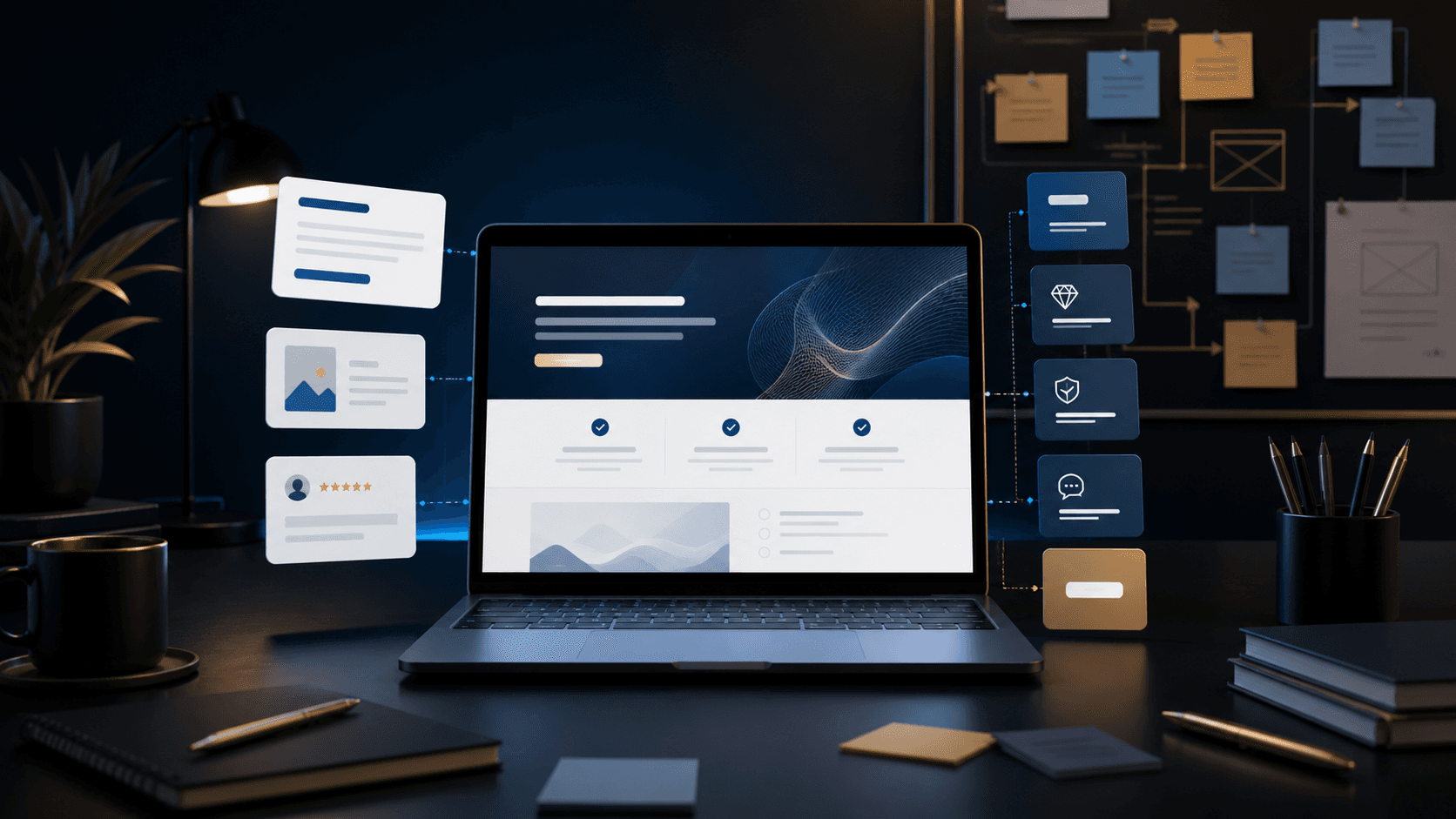
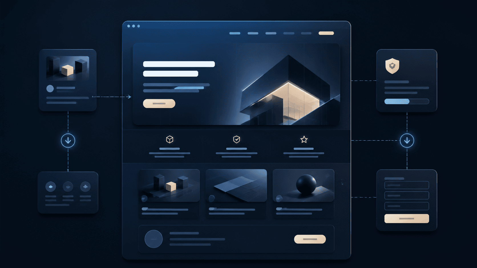
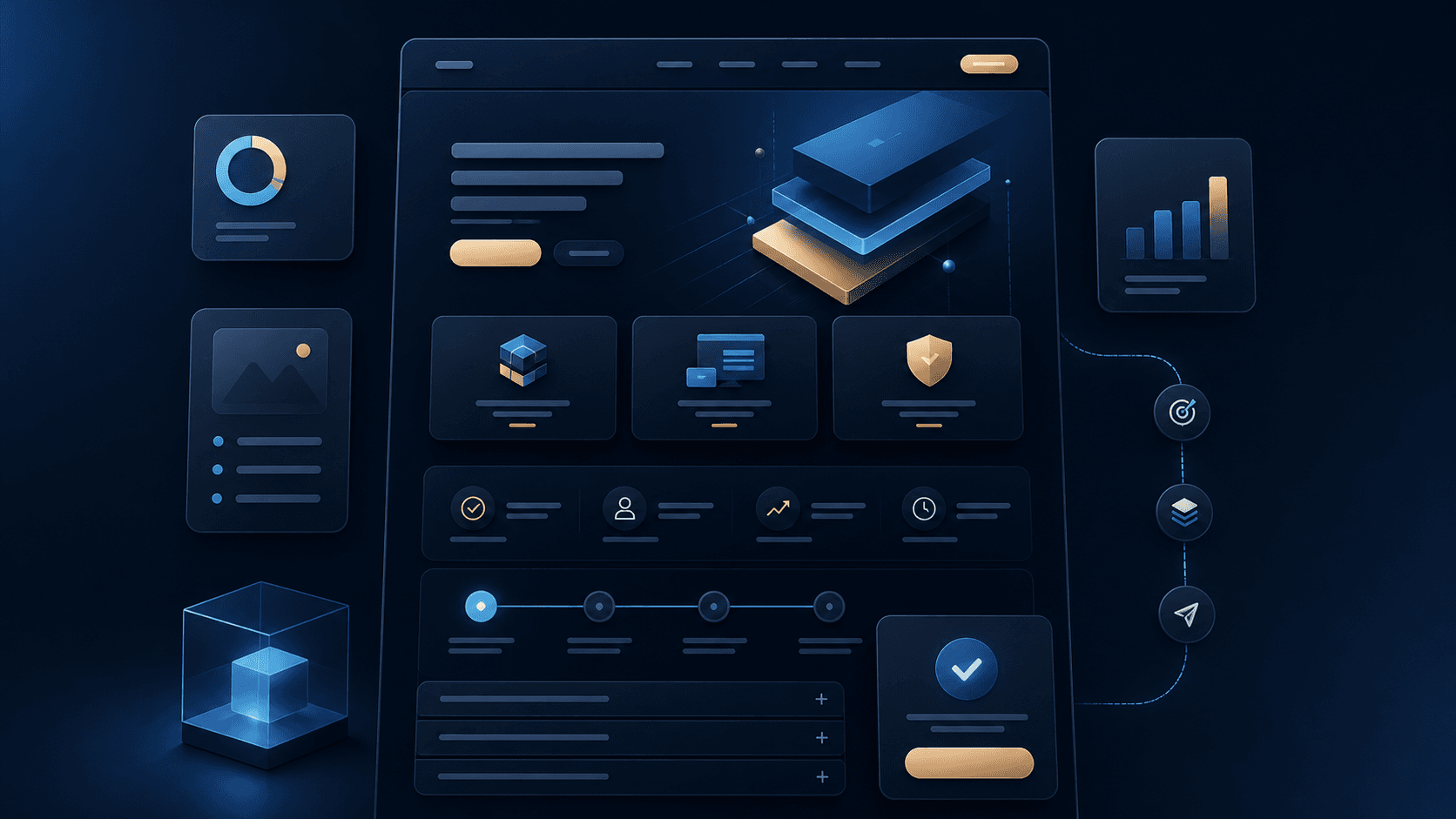
Good structure guides visitors through the decision. First the offer should be understandable, followed by benefits, process, examples, frequently asked questions and a clear contact path.
Sections can be short as long as they are concrete. Repeated statements, interchangeable clichés and long blocks of text make a service page harder to use.
- Open with a clear benefit
- Scope of the service in short sections
- Make the workflow or process visible
- Place FAQ and contact directly where they fit
Why the next step has to be visible
Once visitors have understood a service, the page should immediately show what they can do next. An enquiry button must not only become visible after a long search.
The contact path should suit the service. For offers that need explanation, a free enquiry can make more sense than an immediate buy button.
- Place the CTA in the upper area
- Offer it again after important sections
- Word the button text clearly and concretely
- Make the form or contact section reachable without detours
How Digital Vision builds service pages
Digital Vision structures service pages so that visitors quickly understand the offer, the benefit, the process and the contact path. Content is not just designed but arranged in a comprehensible order.
This produces pages that look professional and, in everyday use, help to attract better and more suitable enquiries.